The former National Guard Armory at Kearney, Nebraska, is listed on the National Register of Historic Places. It's not really all that spectacular or unique in its own right -- it probably has or had several twins in other locations, since it was a Works Progress Administration project. But it's a good example of the durability of Art Deco and Streamline as architectural styles. This building, now more than 75 years old, still has a clean, attractive design.
One of the attractions of Art Deco is that it avoided the gaudy over-decoration of previous styles (that gaudiness being a sin of commission that was committed again in later styles), but it also gave, simply, a "look" to its buildings. Whether in the interest of reducing construction costs or of conforming to the modernist or international styles, many buildings lack any sense of style. They are purely functional -- to a fault.
Form should follow function, to be sure. But that does not mean that a building, set about to achieve a particular function, has to be dull and lifeless.
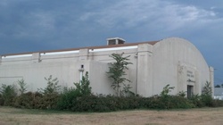
A building can be thoroughly functional, but still have some life in it. Here, that life shows up in little details, like the three stripes embedded in the concrete above the entrance -- or even the small arch they appear to push into the sky. It shows up in the small indentations that surround the window frames. And it certainly shows up in the rectangular pedestals at the corners and along the long stretches of wall. These "little things", as they might be dismissed, break up the monotony of long, flat walls, and add depth to the shape of the building. They're not excessive -- but they're just enough to give the eye something to enjoy.
And that's important, because people have been seeing this building day in and day out for more than 75 years. It occupies both physical space over the land where it sits and psychological space in the minds of the people who encounter it daily. It was worthwhile to reward them with something that says the designer cared enough to give them something at which it would be worth looking.
]]>


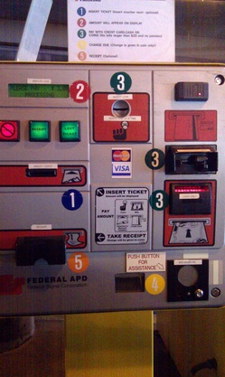 In how many ways does this automated payment machine in a downtown parking ramp fail to make the grade? Let us count just some of the ways: