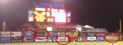
There's no escaping cliches in logo design. People see something they like and think they can make it their own -- and that applies to logo designers and to clients, alike. But there's a point at which over-use becomes almost painful to behold. The swoosh or arc over the right-hand side of a company's name -- intended to connote what, a broad perspective? radio beams? the rings of Saturn? -- is now officially dead. When five out of 21 signs on an outfield wall use roughly the same effect, it no longer has any impact whatsoever. It just looks tired. Nothing could simultaneously represent a labor union, an insurance company, and a cable TV company, among others, and still mean anything useful.