Recently in bad design Category

Signs demand quick comprehension

Wayfaring sign at the Houston airport
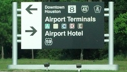
This wayfaring sign appears just outside the exit from the rental-car garage at Houston's Bush Intercontinental Airport. By definition, most of the people retrieving a rental car from an airport are people from out of town -- so it's at this kind of location that clear wayfaring signs allow drivers to quickly comprehend essential information in order to make safe decisions.

It's pretty clear from this sign that downtown Houston is to the left, and the airport hotel is to the right. But why leave the "Airport Terminals" section floating in the strange limbo? Sure, after a few moments of inspection, it appears clear enough that the terminals are to the right. But not at a split second's observation -- and that's not a good way to treat drivers who have just gotten off (often long, uncomfortable) commercial flights in a new city, and who may easily be disoriented as to which way is north (especially after emerging from a sheltered parking garage with no reference to the sun). 

This sign could be fixed easily...move the right-hand arrow up. Or duplicate it (one each beside "Airport Terminals" and "Airport Hotel"). Or draw a single line between the "Downtown Houston" line and the "Airport Terminals" line. Or add some space in the same location. Or change the background color behind the locations in either the right-hand direction or the left-hand one. 

But this? It simply fails the basic need for swift, unambiguous directional communication.

Bad soap dispenser. Bad!

badsoapdispenser.jpg
Clearly, someone failed to think through the position of this soap dispenser. People have already adapted to the bad design by placing paper towels below the dispenser to catch the dribbles, but whomever designed it in the first place should have anticipated that it would cause a mess that couldn't be easily cleaned -- especially considering the lip around the sink is too high for an easy wipe of the counter.

Even without the problem that the soap dispenser is going to perpetually dribble straight onto the counter (rather than into the sink, where it should have gone), there's also the problem that it's too low for anyone with large hands to slide under, and the dispensing nozzle is only an inch away from the bump-out created by the faux granite backsplash. So, every time someone reaches in to get soap to make their hands clean, they're inevitably going to touch either the counter or the backsplash that lots of other people with dirty hands have already touched when they went for their own soap. That backsplash is undoubtedly a little hotspot for bacteria, no matter how good the soap is.

The right-hand arc is played out

Too many swooshes
There's no escaping cliches in logo design. People see something they like and think they can make it their own -- and that applies to logo designers and to clients, alike. But there's a point at which over-use becomes almost painful to behold. The swoosh or arc over the right-hand side of a company's name -- intended to connote what, a broad perspective? radio beams? the rings of Saturn? -- is now officially dead. When five out of 21 signs on an outfield wall use roughly the same effect, it no longer has any impact whatsoever. It just looks tired. Nothing could simultaneously represent a labor union, an insurance company, and a cable TV company, among others, and still mean anything useful.

Nothing about this machine makes sense

courtavenueparkinglotpaymachine1.jpg In how many ways does this automated payment machine in a downtown parking ramp fail to make the grade? Let us count just some of the ways:

  1. No sensible person starts looking for step #1 in the middle of something.
  2. The first-time user probably doesn't expect to be forced into a round-robin experience looking for the next step.
  3. There is no step number three. There are steps 3, 3, and 3.
  4. One of which, by the way, requires that the user insert the credit card upside-down, with the magnetic strip facing up.
  5. The button to request a receipt is between steps 1 and 2 -- but the slip pops out under step #5.
This is, quite possibly, the worst-designed automatic payment terminal on the planet. It should be obvious from the need for a five-step instruction guide (seen on top of the machine) that whomever designed the machine put next to no thought into how the first-time (or even the 101st-time) user would expect the machine to communicate in a clear, concise fashion. If something as simple as paying a parking fee requires following a round-robin layout like this, then something is totally wrong with the design. A parking payment kiosk needs to be quick, intuitive, and easy to use -- or else it's just a way to create traffic jams behind the confused user trying to pay his or her way out.

The phantom toll booth

badtollbooth4.jpg
While there's nothing wrong with toll roads, there's definitely something wrong with many toll booth operations. Requiring traffic to slow from expressway speeds to zero introduces a whole range of problems, since different drivers don't accelerate and decelerate at the same pace. And when traffic designers unwittingly introduce additional confusion into the equation, they're just asking for trouble. Note this photo from a toll plaza. Drivers are being asked to determine, from a distance, into which lane they should drive. The far left is for those with electronic transponders (often called something like "EZ Pass"). The next lane is for those with exact coins. The others are for drivers without exact change, or those who need receipts.

It's not bad enough that the signs are relatively small -- the situation is made worse by including a three-lane gap between "exact coins" and "change/receipts". Three lanes right in the middle -- all closed. That causes anyone who makes a mistake (or who can't read the signs from a long-enough distance) to have to make a dramatic swing across a wide gap of road, cutting into lanes that already have backups.

Worse yet, the only way a driver would know that the three lanes in the middle are closed is to see the red "X" at the top of the sign. You probably find them hard to read clearly in this photo, just as they were in real life. That's because the lane open/closed indicators are surrounded by a lot of other bright lights, and the closed lanes remain brightly lit, even though they're not available for traffic. Anyone who's traveled through a well-lit nighttime work zone knows it's hard for the eyes to adjust from dark nighttime highways to bright light. Asking those drivers to then use bright lights to make decisions that could require crossing three lanes of closed toll booths is nothing more than a recipe for trouble.

This awful approach to signaling drivers where to pay their tolls could be improved by (at the very least) closing the gap between the open and closed lanes, making the open/closed lane indicators wide strips of red or green light (instead of a single "X" or an arrow), and dimming the lights for those lanes that aren't open. By definition, the people using an expressway are oftentimes from out of town and not familiar with local geography. Why make it harder and more dangerous for them to use toll roads than it needs to be?

Not the way to stripe a parking lot

baddesignparkinglot2.jpg
Sometimes a parking lot isn't sized correctly to fit exactly the right number of cars and trucks, so what does a smart designer do with the extra space? Plant trees? Create a special double-deep row for vehicles with trailers? Whatever the right answer is, the wrong answer is to just create a third row between two other rows and draw boxes around each of the spaces. It's bound to confuse anyone the first time they see it, and inevitably someone will end up making the mistake of parking in that "middle child" set of spaces and end up completely boxed-in. How about tearing out the extra row and planting a few trees for shade instead? Or shifting all of the rows over by 10 feet and creating an extra pull-in row (for buses and RVs) perpendicular to the rest at the edge of the lot?

Emergency or just going up?

alarmbuttonnexttoupbutton.jpg
Elevator designers of the world: When you install a button to call the fire department or otherwise signal an emergency, do not -- repeat, DO NOT -- place it above the "Up" button, and then make it more prominent than the "Up" button itself.

People are often in a compromised state of mind when using an elevator -- rushing to get to work, visiting from out of town, or even drunk -- and the natural instinct is to press the most obvious button. In this case, the most obvious button is the one that is backlit and circled with a big black ring. The "Up" button here, by comparison, looks like it's much less important and much less likely to result in a ride anywhere.

All of this is compounded by the fact that it's natural to expect "UP" to be, you know, ON TOP.

This is a terrible example of non-intuitive design. Every signal being sent to the user is to press the wrong button.

Bad design: Chicago police vests

Chicago police officers can be seen walking around the city in what are obviously their bulletproof vests. Many, though not all, uniformed officers are seen wearing these vests on the outside of the uniform shirt. What makes it a design failure?

Watch any of these officers for more than about three minutechicagopolicebulletproofvest.jpgs on any moderately warm day, and the officer can be seen lodging his or her thumbs behind the vest, lifting it just slightly off the chest. Perhaps it's an all-weather condition, perhaps it's not. But it certainly looks like the vest is either too hot or too bulky, making the thumbs-in-the-armholes maneuver almost universal.

Thus, instead of leaving the officer's hands free to do whatever they should be available to do (guard a weapon, guide traffic, or help a little old lady to cross the street), the design of the vest causes many an officer to stand in a completely unnatural and un-ready position for action. The vest acts like a giant pair of armpit-high pockets.

A well-designed vest would accommodate the need for officer safety while leaving the officer comfortable enough at all times that constant adjustment of the vest would be unnecessary. Like a miner's helmet with a lantern attached, the protective clothing should free the user's hands from having to do something, not require them to do more.