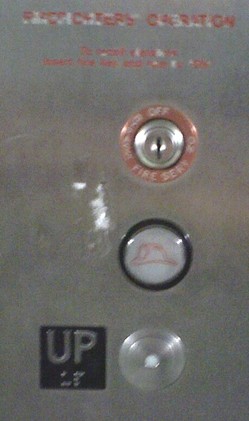
Elevator designers of the world: When you install a button to call the fire department or otherwise signal an emergency, do not -- repeat, DO NOT -- place it above the "Up" button, and then make it more prominent than the "Up" button itself.
People are often in a compromised state of mind when using an elevator -- rushing to get to work, visiting from out of town, or even drunk -- and the natural instinct is to press the most obvious button. In this case, the most obvious button is the one that is backlit and circled with a big black ring. The "Up" button here, by comparison, looks like it's much less important and much less likely to result in a ride anywhere.
All of this is compounded by the fact that it's natural to expect "UP" to be, you know, ON TOP.
This is a terrible example of non-intuitive design. Every signal being sent to the user is to press the wrong button.